INTERVIEW
Christophe Szpajdel on Metal Logo Design & Art
The art behind metal logos
Dear Christoph,
Thank you for taking the time to participate in this interview for PitStop. Your work has become part of the visual identity of extreme metal, but we would also like to explore the ideas, experiences and creative decisions behind it. We are particularly interested in the relationship between music and visual identity, the evolution of your artistic approach, and the challenges facing a specialist artist working in today’s digital environment. If you’d like, we can get started.
Your name is now closely associated with extreme metal logo art, but every distinctive style has a starting point. Looking back at your early experiments, what first drew you to creating band logos, and when did you begin to recognise that this could become a defining part of your artistic identity?
What drew me to create logos were two main influences: a fascination with dark fantasy, dark medieval themes, and early Art Nouveau imagery, which I later labeled "Dark Nouveau." This unique mix of visual elements sparked my interest in logo design.
In the mid-80s, I saw a gap in the creative scene where many bands were in need of an artist who could effectively visualize their ideas. Back then, the metal genre was still forming, lacking a clear direction and encompassing various subgenres like classic heavy metal, hard rock, speed metal, thrash metal, and early black metal, represented by bands like Venom and Bathory. I’d describe that era as seminal, as it was a time of true evolution.
Through perseverance, I began to embrace the idea that logo design could play a vital role in my artistic identity. My interest in logos developed during my teenage years, but faced with disapproval from my parents and other adults, who expected me to abandon what they called "bohomazy"—a Ukrainian term for scary doodles—my motivation only intensified. Their lack of support ironically fueled my passion, and I can confidently say that my perseverance has truly paid off.
Before the Internet
You were developing your skills during a period when the underground metal scene depended heavily on fanzines, physical correspondence and the exchange of printed material. How did that environment shape your relationship with the scene, and what do you think has been lost—or gained—as underground metal culture has moved online?
Before the internet, communicating with fellow music lovers was a richer experience, rooted deeply in personal connections. Writing letters, sometimes including audiotapes, was a labour of love. Discovering music often meant diving into specialised magazines that focused on specific genres—especially fanzines dedicated to niches like punk, hardcore, and metal. Metal, in particular, drew me in with its powerful sound, striking imagery, and a sense of rebellion that really spoke to my personal taste.
Heavy guitar riffs and memorable solos were essential; I craved intensity and aggression, paired with unique melodies that made it all the more captivating. For me, a great metal song balances aggressive energy with distinct melodic elements—whether through guitar solos, clever riffs, or interesting drum patterns. Synth-pop, with its heavy reliance on synthesisers, never quite resonated with me, even though I appreciated some new wave bands like The Sisters of Mercy, The Cure, and Depeche Mode.
Reflecting on the metal scene, some of my favourite bands that come to mind are Venom, Celtic Frost, Possessed, Slayer, and early Metallica. It's interesting to note that many of those bands, like Nasty Savage, At War, Necrovore, Infernal Majesty, and Sadus, remain underrated gems in the genre.
What has truly been lost is that sense of camaraderie—writing letters and waiting for replies, relying on postal services for the thrill of receiving a new record, and travelling sometimes long distances for those intimate gigs. The rise of the internet has shifted the focus towards larger, commercial festivals, often at the expense of the smaller shows that once nurtured a tight-knit community.
However, the internet has also transformed the industry and how we discover music. The convenience of sharing music links on platforms like Bandcamp has revolutionised how artists interact with fans—it's quicker, easier, and has opened the door to accidental discoveries. Occasionally, stumbling upon an unexpected artist or track can feel like finding a hidden gem, and those moments often become the most rewarding.
As an artist myself, I've embraced this shift by hosting virtual art exhibitions on social media like Instagram, showcasing my work and the creative process behind it. It's been a fantastic way to engage with an audience, as people share their discoveries, creating a ripple effect of exposure. Yet, this digital landscape has its downsides. With so much content out there, it can become overwhelming—a cacophony of noise that drowns out the truly unique voices.
This overabundance reminds me of an ecological challenge where
The sheer volume of information makes it difficult to distinguish what truly matters.
Your logos are often immediately recognisable, even when the bands themselves work in very different musical styles. How do you approach the challenge of creating something that serves each band's identity without losing the individuality of your own artistic language?
My approach to logo design is deeply rooted in understanding each band's unique identity. I always start by listening to their music and exploring their background, which helps me grasp their vision and the atmosphere they want to convey. Every band has its own character, and my goal is to reflect that through the design.
I also believe it's important to challenge myself with each project. I don't want to repeat the same ideas or rely on familiar solutions. Instead, I experiment with different shapes, letterforms and arrangements until I find something that feels right for the band. Sometimes, the smallest detail can make a significant difference.
At the same time, I don't consciously try to hide my own style. It naturally comes through in the way I approach shapes and composition. Even when the results look very different, there is usually something that connects them to my way of working.
For me, the most satisfying result is a logo that fits the band perfectly while still feeling like an individual piece of artwork.
The Relationship Between Music and Image
A band's logo is often the first visual point of contact between its music and its audience. How important is it for you to understand the music itself before beginning a design, and have you ever found that your initial visual interpretation of a band changed significantly after listening more closely to its material?
Understanding the music is essential to my process. I need to get a feeling for what the band is trying to communicate before I can translate that into a visual form. The music gives me clues about the atmosphere, the intensity and the character that the logo should express.
Sometimes, my first impression is quite different from what emerges after listening more closely. A band might initially sound aggressive, but there may be more subtle elements beneath the surface. Those details can change the direction of the design.
I don't think a logo should simply illustrate the genre. It should capture something specific about the band itself. Two bands playing the same style of music can have completely different identities, and their logos should reflect that.
Listening helps me make those distinctions. It gives me a starting point, but the final design also depends on the conversations I have with the band and the ideas that develop during the process.
Every commission involves a dialogue between the artist and the band. Some clients arrive with a clear idea of what they want, while others expect the designer to guide the process. How do you handle these different approaches, and what makes a collaboration particularly successful or difficult?
Working with clients can be challenging because everyone has a different way of communicating their ideas. Some bands know exactly what they want, while others have only a vague impression of what the logo should look like. In those situations, I have to ask questions and explore different possibilities with them.
I try to understand what the client wants rather than immediately imposing my own ideas. At the same time, I need to use my experience to guide the process. Sometimes, clients don't know how to explain what they have in mind, and visual examples can help us find a common direction.
Communication is very important. If a client doesn't respond to questions or provide feedback, it becomes difficult to move forward. I need to know whether we're heading in the right direction before spending too much time developing a design.
The best collaborations happen when both sides are willing to communicate openly and respect each other's contributions. The band knows its music and identity, while I bring my experience as an artist. When those two perspectives work together, the results can be very satisfying.
From the First Sketch to the Final Logo
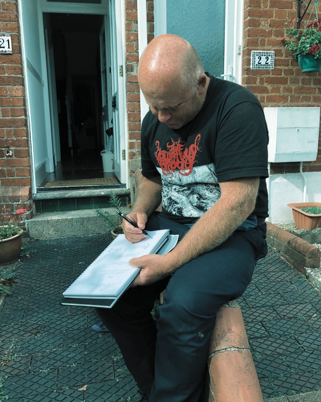
Your process often involves several stages, from initial concepts and pencil sketches to ink drafts and final refinements. Could you walk us through the development of a typical commission, explaining how you move from an initial idea to a finished design and how client feedback influences the process?
My process begins with understanding the client's vision and gathering references. I often ask clients to provide examples of what they like, as this helps me understand their expectations. However, I also need to explain that creating a logo takes time and that they shouldn't expect to receive their initial investment without realizing the frustration that awaits them.
They often aim for a final design that closely matches examples they've shared, but at least my preliminary works are not wasted time. I explore a variety of concepts, akin to testing different paths in an alphabet until I find the right one. When a sketch resonates, I refine it into an ink draft, allowing me to make symmetry and balance adjustments. This process involves further thumbnail sketches that can be consolidated to provide the client with numerous options.
Next, I refine the ink sketch using a light pad, focusing on the balance and overall shape before presenting a pencil draft. However, clients often struggle to provide feedback at this stage, as it doesn’t yet resemble a finished logo. We're discussing letter interactions and how to make the logo engaging enough to draw attention to the music.
Once we've navigated these initial steps, I can explore different finishes based on what the client desires—be it outlines, splatter effects, or other unique elements. Many clients may not voice their needs explicitly, but they expect options. If I'm unable to provide various choices, they’re likely to seek these elsewhere, which is a critical point to keep in mind. Losing a client is easy, but winning them back is often impossible. The final stages of my process involve clear communication and discovery through drawing, experimentation, and revisions. While rounds of revisions are typical in my projects, there are rare exceptions—like the logo I created for "Emperor," which was accepted on the first pass without any revisions. This experience demonstrates that when the collaboration is right, the creative process can flow seamlessly.
You have described your approach through the idea of “Archaic Modernism,” bringing together elements that can appear ancient and contemporary, organic and constructed. How has this concept developed over the years, and how does it help you avoid repeating your own visual solutions while retaining a recognisable personal style?
The idea of Archaic Modernism fascinates me because it embodies a harmony between the ancient and the futuristic. When I create mood boards for logo design, I find it essential to blend elements that resonate with both thrash metal's raw energy and abstract designs' complexity. This balance can manifest in a wide range of styles—everything from structured precision to chaotic freedom, reflecting qualities like the smoothness of laminar flow versus the unpredictability of turbulence.
I constantly seek inspiration from other creatives, absorbing their insights and methods without simply replicating their work. It's like a refreshing breeze that sparks new ideas, especially when I encounter artists who push boundaries—like a dark tattooist working with bold, gangster-inspired fonts or a designer experimenting with gravity-defying concepts. Their unique approaches encourage me to evolve my artistic voice while maintaining my personal style.
Retaining my individuality is crucial. Even as I experiment and explore new directions, my core style inevitably surfaces. I aim to surprise viewers, prompting them to ask, "Did you just create that?" This sparks a dialogue in their minds—am I challenging their expectations? I work hard to avoid becoming clichéd or predictable, striving instead for a sense of novelty that can leave people wondering, "Is that even possible?"
Ultimately, I want my creations to evoke a reaction that leads people to introspection. I prefer to let the audience ponder their questions rather than provide them with easy answers. It's more rewarding to leave a trace of surprise and intrigue in my work, inviting them to explore the boundaries of what they thought was possible.
Although extreme metal is central to your reputation, your interests and artistic influences extend well beyond music, including calligraphy, architecture and the natural world. Which of these other fields has most significantly changed the way you see shapes, lines and lettering, and has an influence from outside metal ever led you towards an unexpectedly different result?
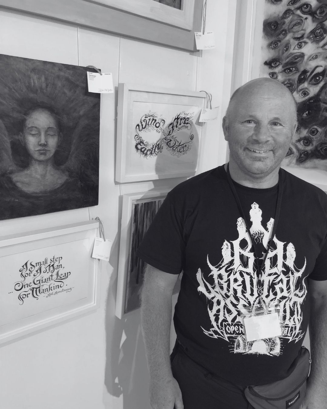
Going beyond the confines of metal music, I found myself evolving as I entered adulthood, particularly in my early 30s. This transition felt significant when I moved from Belgium to the UK. In this new chapter, I began to explore interests that extended well beyond music, diving into calligraphy, architecture, and the wonders of the natural world. The natural world had always captivated me since childhood, providing a stark contrast to my musical inclinations.
Among the influences that reshaped my approach to logo design were the aesthetic principles of Art Deco and Art Nouveau. These styles provided me with fresh perspectives on letterforms, particularly in how to exploit the interplay between positive and negative space. A striking example of this is the Agaliaroth logo, which I’ll be sharing in a WeTransfer folder shortly. It demonstrates how the natural harmonies found within contrasting elements can spark inspiration for my creative processes.
I’ve come to believe that limitations exist only in our minds. When we begin to harness our imagination, the possibilities become endless. That philosophy is precisely what drives me to step outside of my comfort zone. Over the past five years, particularly during the Covid pandemic, my interest in politics blossomed. This newly found passion led me to create cartoons that reflect my evolving viewpoint, also included in the WeTransfer folder.
When an idea resonates with you and ignites a curiosity you can't shake, it’s a clear sign it’s worth pursuing. The journey of exploration has been transformative, and I’m excited to see where it leads next. As for my progress, here's a good way to tell: if you sniff out an idea and you can’t shake it off your mind, you know it’s worth pursuing.
The Artist in a Digital Age
Digital tools have changed how logos are designed, refined, delivered and reproduced. Artificial intelligence has introduced another layer to that change. Which parts of the creative process do you think can genuinely benefit from these technologies, and where does the human artist's judgement, experience or intuition remain irreplaceable?
Digital tools have significantly enhanced my interactions with clients. For instance, I use Grammarly to reply to emails quickly and effectively; it suggests ways to craft responses that are engaging, assertive, and pleasant to read. When discussing ideas with clients, I find that creating a quick Photoshop mock-up allows me to convey how a logo should look more efficiently. This approach expedites the creative process because clients can visualize their ideas rather than relying on lengthy explanations, which can lead to multiple interpretations.
I believe that digital tools have helped me tailor my logos more effectively. However, intuition also plays a vital role in my creative process. That said, intuition can sometimes result in misinterpretations of a client's vision. My goal when designing a logo is to bring the client's vision to life. While artificial intelligence is a valuable tool that can assist in this process, it's important to remember that it serves best as a tool and not as the primary decision-maker.
A logo may circulate across merchandise, album artwork, online platforms and reissues long after the original commission. From your experience, how well are the authorship and rights of logo artists understood and respected within the metal scene? Are there particular gaps in how these rights are acknowledged or protected, and what changes would help establish clearer expectations between artists and the bands commissioning their work?
This is a complex and challenging issue. I have been creating logos since the late 1980s and early 1990s without interruption. Recently, I noticed that many of the bands I designed logos for years ago have re-emerged with entirely different logos. For example, the U.S.-based band Severed Faith acknowledged that I created their logo in the early 2000s. However, they could have reached out to me about designing a new logo that aligns more closely with their evolving musical style. They mentioned being huge fans of my work and still appreciating the original logo, but they have chosen to use a new logo designed for free by a friend.
Another similar case involves the band Nachtmystium, which contacted me about updating the logo I created for them. I responded to their inquiries, but unfortunately, they did not reply to my emails. This highlights a critical issue regarding the respect for the authorship and rights of logo artists, which greatly depends on communication. The sudden drop in communication from clients—who vanish and then reappear with unexpected changes—needs to be addressed.
Fortunately, there are conscientious clients like Kalmar, who asked for clarification on the ownership and usage rights for their logo. They wanted to know if, once the commission is fully paid, they would own the logo and have full rights to use and modify it for their brand, including for merchandise and promotional materials. They also inquired whether the rights would be exclusive to their brand. Clients like Kalmar set a standard for clear communication and respect for artists’ rights that should be maintained.
There is an apparent contradiction in being widely recognised within a scene while finding it difficult to make a sustainable living from one's work. Beyond questions of authorship and rights, what practical and economic challenges make it difficult for a specialist logo artist to sustain a career today? What could bands do differently to make commissioning and working with independent artists more sustainable in the long term?
It’s often frustrating to see how people perceive success in the design world. Many think that just because I've created numerous logos throughout my career, I must be rolling in wealth. The reality is much different. My designs are more of a side hustle—a blend of hobby and secondary income—rather than my main source of revenue.
The competition in the market is fierce, and it’s so easy today for anyone to get a logo at a rock-bottom price, sometimes as low as $2 from designers in places like Indonesia, Malaysia, or China. Clients often lean toward these quick, cheap options instead of engaging in meaningful conversations about their vision, which can lead to a much richer outcome.
My approach to design involves a lot of careful thought and handcrafted work, which naturally takes more time than simply tapping on a tablet to generate multiple designs in a snap. Although I deeply respect talented designers like Marc Riddick, Raoul Mazzero, and Voytech Moonroot, it’s evident that the influx of low-cost designers can undermine the value of skilled artisans.
This is precisely why I’ve held onto my day job as a retail assistant for over 20 years. Relying solely on logo design wouldn't be sustainable for me. Many clients promise the world but often fall short when it comes to keeping those commitments. Consistent communication is key, yet it’s something I find lacking in most interactions.
I would much prefer to work with a small number of clients who truly appreciate my work and seek to collaborate with me for my unique perspective, rather than rushing to produce something for the sake of it. It’s a bit like a race: sometimes, the most impressive competitor might not even finish first, but that doesn’t diminish their skill or artistry. Instead of trying to prove myself, I believe it's important to honor the artistry and dedication that define a genuine creative journey.
You have accumulated an enormous body of work over the course of your career, including original sketches and finished designs. How do you organise and preserve this archive, and have you considered how it might eventually be presented to the public or passed on so that future generations can understand the development of your art?
I have accumulated a substantial body of work, and I have all my logos organized in different boxes as well as on paper in the living room of my flat. Before moving into my permanent flat, where I have been living since 2012, I lived in shared accommodations. This setup allowed me to save a significant amount of money, as I had my own room in a shared house with shared facilities and expenses.
Due to frequent moving between 2000 and 2012 when in the UK, I often faced challenges. There were times when my landlord sold the property unexpectedly, giving me less than a month to find a new place. In some cases, I had to leave after just two weeks due to various problems in the new property.
I have encountered several managers who claimed to provide artist management, but none have successfully convinced others to present my archive to the public. Despite many promises, none have been fulfilled. As a result, I would like my entire body of work to be housed in a museum, allowing people to view it as if it were in a library. This desire is also why I have published three books—each serves as a living testament to my art.
There are logos that I am not comfortable sharing, either because the clients were controversial or because I wished to dissociate myself from certain projects. In the 1990s, this was more common, but after moving to the UK in 2000, I became more selective, relying on my instincts to assess potential clients.
Now that I use email and social media for communication, I have established a solid policy. For several years, I have required a deposit before starting any new project.
Some of your work appears to connect with personal history and cultural heritage beyond the metal scene. Your “Reminiscences of a Past Long Since Gone” project, for example, has been associated with your family background and an exhibition concerned with Ukrainian heritage. How do personal experiences and historical memory enter your art, and how do you decide when such material should remain personal and when it becomes part of a work's public meaning?
“Reminiscences of a Past Long Since Gone” was indeed a collective art group exhibition I curated in September 2024 at Leadworks in Plymouth, and it was themed on different cities in Ukraine and how they were looking like before and after being “liberated” by Russian troops. Liberation from what? Your heritage? Your own identity? Your close relatives, who are now buried under the rubble or six feet under? There isn’t any liberation! It’s like “Have your cake and eat it....but there isn’t any cake!”
The war in Ukraine began in 2014 with the Revolution of Dignity. Initially, it was a counter-revolution triggered by (pro-)Russian groups in Crimea and Donbas, which had been simmering for many years before Russia's full-scale aggression against Ukraine commenced on February 24, 2022. I have Polish parents and Ukrainian heritage on my father's side. I felt it was essential to share my personal experience and integrate it into my public work. I wanted to ensure the world understands Ukraine's role in defending Europe against Russian imperialism.
In 1970, my parents left Poland for the same reason: to escape Russian imperialism. They were convinced that Poland and Ukraine would never truly liberate themselves from Russian oppression and domination. The situation has worsened recently, as Donald Trump seems to be aligning himself with Vladimir Putin. This alarming alliance between the U.S. and Russia poses a significant threat to Europe. It is crucial to bring this issue to the world's attention, as Europe is in severe danger. Now things are getting worse because the American crusty orange ball sack, Mr Donald Trumpty Dumpty, is now siding with Dracula's second cousin, Mad Vlad poo-tin. “Trump needs mental treatment”. This is something I want to bring it to the attention of the world: Europe is in severe danger because now the USA and Russia are officially becoming allies.
You developed your style largely through self-directed practice rather than following a conventional path of formal training. For artists who want to develop a distinctive visual language today, what matters most: technical discipline, studying other artists, experimentation, or learning to trust their own instincts? How can they draw inspiration from established work without becoming imitative?
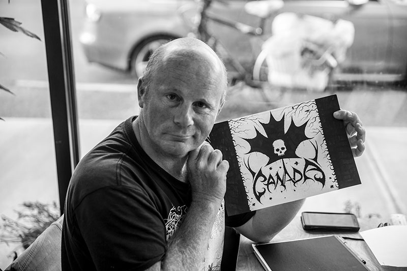
Being autodidactic is the ultimate way to learn and progress on your own terms—it's about doing it your way and being the boss of your journey. For artists aiming to develop a distinctive visual language, what truly matters is studying the artists you admire, not just those assigned by a course. Dive into the creative processes of those who inspire you; I’ve been exploring the works of various creatives, particularly in the gangster style, including bold tattoo artists, graffiti creators, and traditional calligraphers. Select the ones that resonate most with your vision, and trust your instincts. Follow your passion; study the artists that speak to you, learn how they implement their work, and discover key takeaways. Draw inspiration from their techniques and see how you can adapt them into your own projects, allowing your uniqueness to shine through. It's akin to teaching a broom to carry buckets of water to lighten your load, yet you must also understand how to manage the work once the well is full. This is where you master your craft and cultivate discipline.
What Remains
After decades of creating logos for bands across different generations of extreme metal, what would you most like people to understand about the art form beyond its immediate association with music? When you look towards the future, what would you still like to create, preserve or accomplish—and what would you hope your body of work ultimately leaves behind?
What I hope people understand about this art form, beyond its connection to music, is the entire creative journey involved in developing a logo, from initial sketches to the final product. This journey is intricately linked with the client's vision and the music style of the band, ensuring that the logo serves as a powerful visual representation between the viewer, the listener, and the performer. A band is not just a group; it is also a brand that embraces visual aesthetics. As I look to the future, I aspire to preserve the art of handmade and analog creations, aiming to showcase my work at exhibitions for a targeted audience. Recently, I've been approached by influential platforms like Fondazione Effetto Arte, Oasi exhibitions, Art Nou Gallery Barcelona, and Itsliquid group. While they offer great opportunities to elevate my work, I recognise they primarily cater to art collectors focused on flipping artwork for profit, rather than the audience I seek to engage. My work resonates deeply with those who share a passion for metal music and its messages. The metal-inspired logos I create are more than just cool designs; they embody a cultural essence. Like the unforgettable designs I crafted for Rihanna's VMA awards tour in 2016, my art appeals to people who genuinely appreciate the heavy metal aesthetic and typography. This appreciation stands the test of time. Metal is a lifestyle, not a fleeting trend. Think of the timeless classics: Motörhead, Metallica, Slayer, Mercyful Fate, Iron Maiden, and Black Sabbath. Metal should be celebrated as a classic, and it’s essential to grasp the true essence of the metal lifestyle.

Christophe Szpajdel